Which Layout Choices Enhance Reader Experience
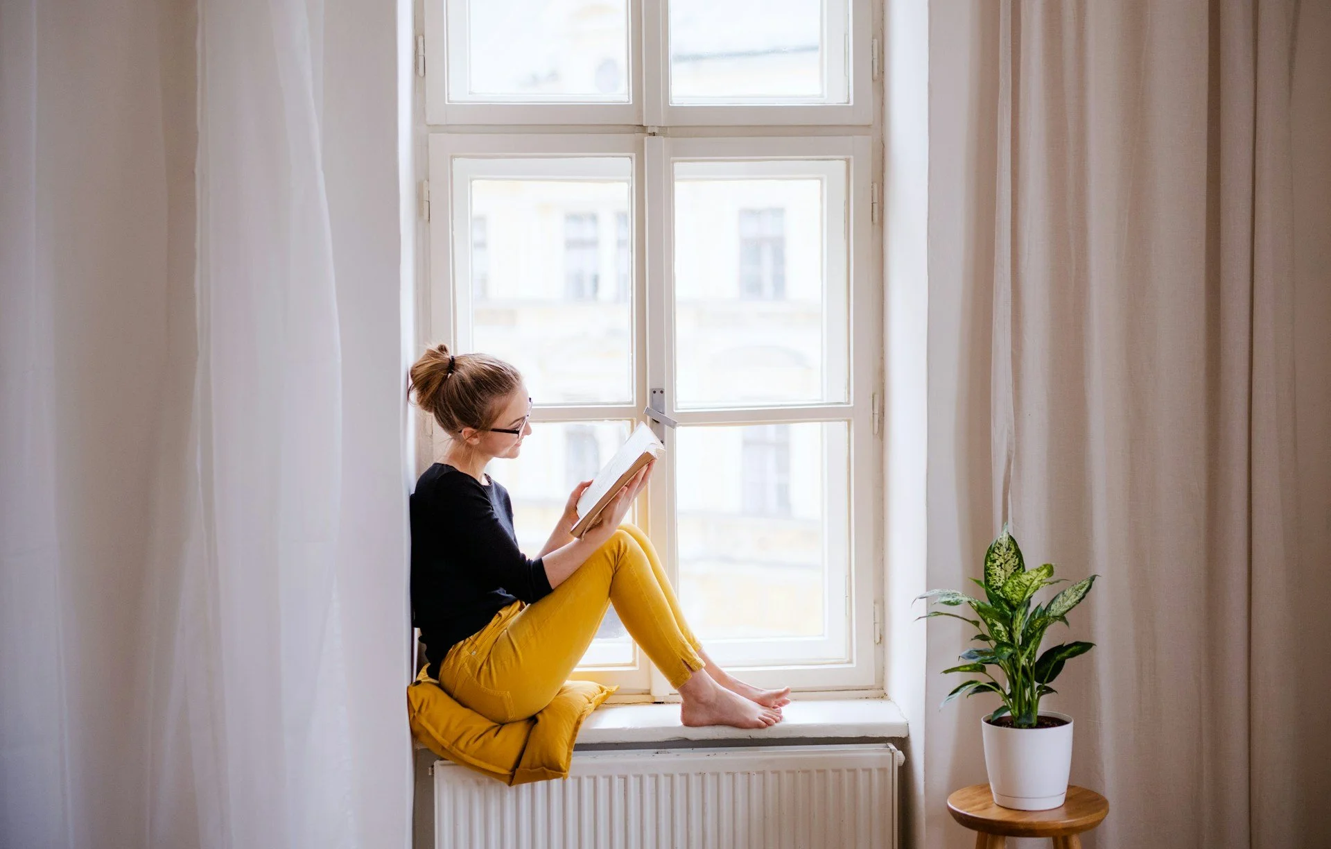
When someone picks up a book, there’s usually more than just words pulling them in. The layout plays a big part in how easy it is to read, how long someone sticks with it, and how interested they stay. Whether it’s a novel or a workbook, a smart layout can turn average pages into something readers really want to spend time with.
Good print design doesn’t just look neat. It helps readers move through the story or the content without distraction. From spacing and fonts to structure and flow, each design choice carries weight. If something feels off visually, it can be enough to break focus. But when things are thoughtfully arranged, readers are more likely to enjoy the content, stay engaged, and take it all in more easily.
Importance Of Readability: Get The Basics Right
Readability starts with how the text is placed on the page. If letters are cramped or packed too tightly, reading becomes a chore. Get the right spacing and font, though, and readers won’t even think about it. They’ll just keep turning pages.
Some important layout choices that support readability:
- Font size and type: Use fonts that are clean and easy on the eyes. A font that’s too small will leave readers squinting, while anything overly decorative can slow them down. A balanced serif or sans serif typeface works well for longer texts
- Line spacing: Lines that are too close together feel heavy. More space between lines can help keep the eyes moving naturally. You want your reader to feel like they’re gliding through, not fighting the page
- Margins: Margins give the text room to breathe. They prevent the lines from running too wide, which makes it easier for the eyes to return to the start of the next line. Consistent margins also give the entire book a cleaner, more polished appearance
Subtle changes here can make a noticeable difference. Think of it like chair height at a desk. Too high or too low makes the work uncomfortable. A good reading experience needs just the right balance so the reader can focus on the words instead of the layout fighting them.
Visual Hierarchy: Guide The Reader’s Eye
We often think of book layout as being about making something look tidy, but it’s more than that. A strong layout uses structure to show the reader what’s important and what to look at first. That’s where visual hierarchy comes in.
This idea helps organise the page by making key information stand out through size, boldness, spacing or placement. A good visual hierarchy can turn a block of text into a well-marked path.
Here’s how visual grouping helps guide the reader:
- Titles catch attention and set the tone
- Subheadings break information into sections
- Bullet points help list details quickly
- Indents and paragraph breaks give the eyes space to rest
Imagine flipping through a guide with no headings, no spacing and no signals for where one topic ends and another begins. It won’t take long before you feel lost. On the other hand, pages with clear titles and organised sections help readers find what they need and know what to expect.
For example, a how-to book on gardening benefits from being broken up by seasons, types of plants or task lists. Visual layout choices like bold headings, numbered steps and clear lists help readers get through information quickly and retain it better.
Even in fiction, a strong hierarchy keeps chapters structured and easy to follow. Whether the goal is entertainment or education, the layout becomes a quiet helper, always working in the background. When done right, readers may not even notice it, but they will definitely feel the difference.
Using Colour And Images Wisely
When working on book layout, the wrong colour combinations can cause more harm than good. Bright backgrounds, clashing fonts or poor contrast make pages hard to look at. On the flip side, calm and balanced colour choices support the story, message or purpose. They guide the mood without distracting the eye.
The goal is to use colour as part of the layout, not as decoration. It should support the content rather than compete with it. Section colours can help break chapters apart or separate themes. For non-fiction, colour-coding subjects can make information easier to find. But even gentle changes, like using a light tint behind pull-out quotes, can help key points stand out without being overwhelming.
Images and illustrations also deserve careful placement. They’re at their best when they serve the text rather than interrupt it. A large photo shoved into the middle of a paragraph breaks the flow. But an image placed after a section, aligning with the message just read, adds value. Photos, graphs or drawings work best when they help the reader see what’s been explained, give extra context or introduce a new topic.
To keep things balanced:
- Stick to 2 or 3 main accent colours. Too many can be distracting
- Choose images that match the tone of the content
- Ensure contrast between text and background is strong enough for legibility
- Place visuals near relevant paragraphs for smoother reading
For example, a cookbook with clean typography, soft background colours and well-spaced recipe photos not only looks good but helps readers better prepare meals step by step. The format builds trust between the reader and the content, much like how a well-lit kitchen encourages better results.
Consistency And Layout Flow
Consistency isn’t about every page looking identical. It’s about creating rules that give your book a steady rhythm. Readers pick up on patterns. Once they get used to a layout style, their brain relaxes a bit, expecting that chapter titles will look a certain way or that tips will always be marked in the same font or shape. If that rhythm breaks without reason, it makes the book feel heavier or harder to track.
To keep the flow smooth, it's worth deciding on a few things from the start, like:
- How chapter headings will appear
- Where page numbers go
- How quotes or callouts are styled
- Whether body text is justified or aligned left
When these elements carry through from the front cover to your final page, the book feels thoughtfully designed. Transitions between topics, chapters or themes are easier for the reader to absorb.
You’ll also want to make sure there's a logical build from page to page. If the layout's pacing jumps around, cramping one spread and sparse on the next, readers may find themselves flipping back, re-reading, or scanning too quickly.
Fiction books benefit from quiet space and visual breaks between scenes or sections. Nonfiction becomes clearer when sections follow a defined structure with headers, boxes, and summaries spread in a pattern.
A good layout allows the reader to build a kind of muscle memory as they read. They know where to expect certain things, how each part flows into the next, and what each change in design means. Done well, it’s invisible, but it has a powerful effect on how long someone stays hooked.
Design Choices That Make a Real Difference
Thoughtful print design is about more than just appearance. When you put effort into font choices, spacing, structure and colour with the reader in mind, your book immediately becomes easier to engage with. It builds confidence in the reader. It shows care. And it helps deliver your ideas clearly, start to finish.
By focusing on layout basics like readability, structure, flow and visual elements, you create a smoother reading experience from the ground up. Whether it’s a hands-on guide, a memoir or a novel, layout ties every part of your book together. It’s not just what’s on the page; it’s how every part of the page works with the rest.
Readers may not always be able to put their finger on why a book is so easy to read, but they will notice when it’s tough. Putting care into layout, from fonts down to image placement, gives your content the support it needs to make a real impact. When everything fits just right, it helps the story or information shine and keeps your reader turning the page.
Elevate your book's design to captivate your audience with thoughtful layout elements that enhance readability and visual appeal. At Spine Book Printing, we're dedicated to bringing your masterpiece to life, providing expert guidance on everything from font choices to strategic, engaging layouts. Discover our specialised services for printing paperback books to ensure your work not only reaches your readers but resonates with them, creating an unforgettable reading experience.