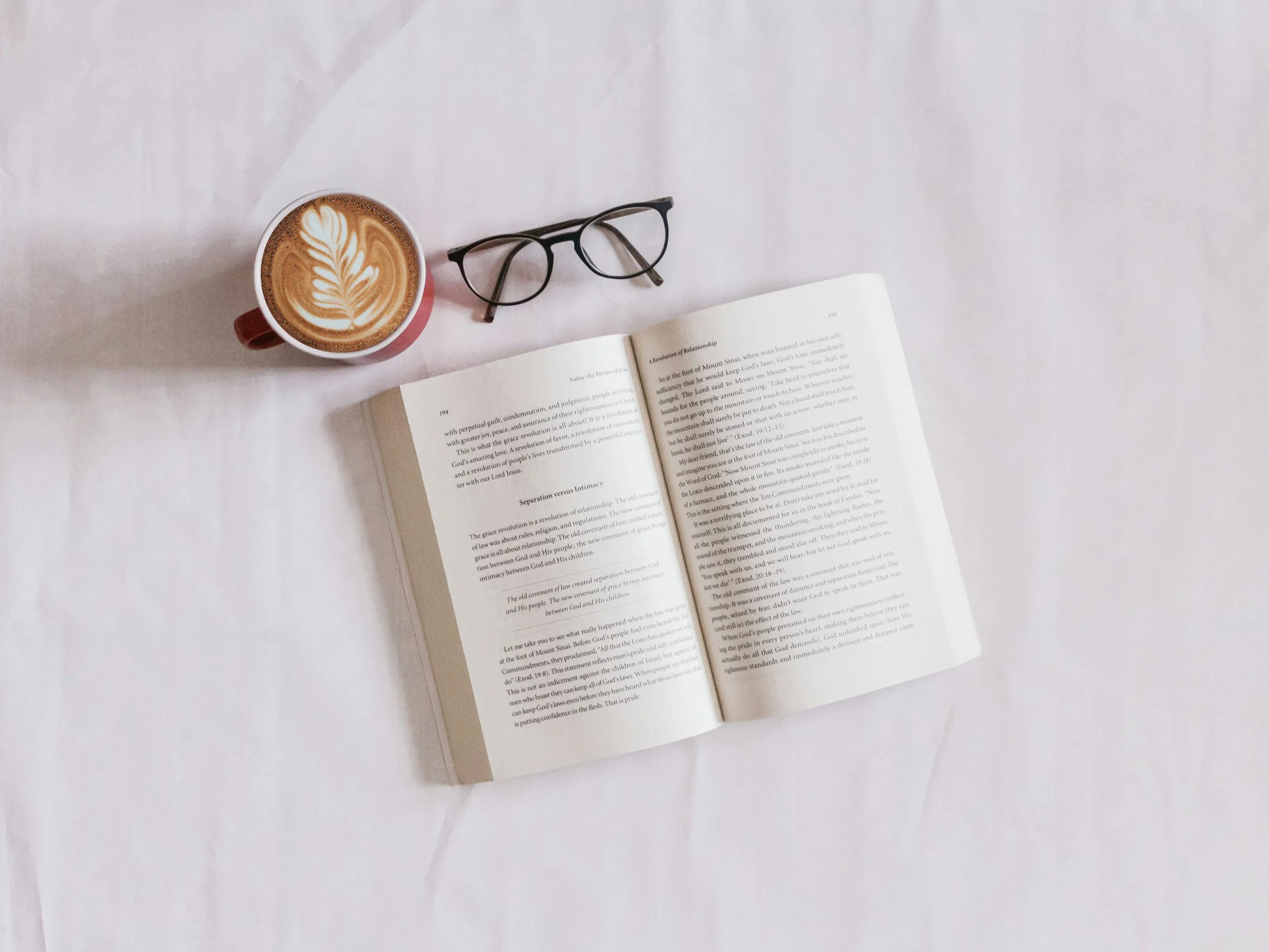
How to Print Paperback Books Without Layout Errors
When you print paperback books, layout matters just as much as the writing itself. Strong content can appear rushed or unreadable if the pages aren’t set up properly. It’s easy to overlook things like margin sizes or page order when you’re excited to get to print, but these small details shape how the book feels in someone’s hands.
We’ve seen how layout errors can pull a reader out of the story or make a book harder to follow. Whether it’s misaligned headers or cramped text near the spine, these issues can be avoided with a bit of early planning. Here is where layout problems often happen and how to spot them before they go to print.
Common Layout Mistakes That Cause Trouble
A book can look fine on screen but feel awkward in print. Sometimes the layout problems only show up once it’s held in physical form.
• Text sitting too close to the trim edge can get cut off during printing
• Narrow inner margins near the spine make it hard to read without cracking the binding
• Page numbers or chapter titles that fall outside expected spots can feel unorganised
• Inconsistent headers or font sizes across pages can distract from the content
• A table of contents that doesn't match actual page numbers causes confusion
Many of these issues come from small formatting oversights. They don’t take long to correct, but they’re easier to fix before files are finalised.
How to Build Margins That Do Their Job
A good margin layout isn’t just about visual balance. It affects how comfortably someone can read each page and how well the book holds together.
• Set your outer and top margins wide enough to keep text away from the trim line
• Leave extra space in the inner (gutter) margin so words don’t disappear into the spine
• Use consistent spacing from page to page, especially when switching between sections
• Avoid squeezing text into every inch of the page just to save space
Balanced margins help the overall structure feel deliberate. When spacing supports the design, the reader can stay focused on the story instead of fiddling with the book just to make out the text.
If margins are too tight or if the text nears the edge of the page, it can interfere with readability and cause difficulty in seeing the full line. Sufficient margins support comfortable handling and keep printed text away from the trim line, reducing the risk of content loss during binding or cutting.
Fonts, Spacing and Flow That Feel Natural
Styling choices create the rhythm of a book. If fonts, paragraph breaks or line lengths feel off, it becomes harder to follow the writing, even when the content itself is strong.
• Choose fonts that are legible in print, without sharp contrasts or decorative effects
• Stick with one or two fonts throughout instead of switching styles across chapters
• Use line spacing that leaves breathing room without looking scattered
• Keep paragraph indents consistent, and break up long blocks of text with short paragraphs where needed
• Avoid relying too heavily on bold or italics, which lose impact when overused
These choices set the tone for your book. Matching design with content tone makes the reading experience more comfortable and draws the reader forward without effort.
Keeping your chosen fonts and spacing consistent will also help keep the book’s layout clean throughout, preventing distractions for readers. Uniformity from page to page means the reader’s attention is on the material, not on correcting visual differences or fixing their own reading position. Subtle but even spaces between lines and a gentle visual rhythm keep each section inviting.
Prepping the File With Print in Mind
Before a book reaches the presses, we expect a setup that supports clean layout. It makes our job smoother and helps avoid delays caused by unclear formatting.
• Align page numbers, headers and footers across all pages so they don’t shift position without reason
• Check that image placement supports the text, not breaking into it or forcing awkward line breaks
• Use a layout template that includes bleed and safe zones everywhere they're needed
• Keep your file in a print-ready format, without hidden elements or incorrect page sizes
These steps keep the print version true to what you intended. If headers bounce up and down across pages or an image cuts through important text, the finished book won’t have the clarity readers expect.
Bleed and safe zones are essential for clean production. By setting up these boundaries, you ensure that any background images, colours, or graphic elements extend far enough to be trimmed accurately, while also keeping main content well inside a safe border so nothing is lost. Print-ready files should be exported in PDF with fonts embedded and all control marks or hidden editing features removed to guarantee accuracy on press.
Reviewing the Final File Before Upload
Before sending your book to print, we always suggest giving files a final look with fresh eyes. It helps catch mistakes that are easy to miss when you’ve been staring at the same content for days.
• Scroll through every page in order to see if text jumps, margins shift or pages are misaligned
• Watch for unwanted blank pages between chapters, or pages without headers where they should be
• If possible, print off a copy at home to test how the layout feels when flipping through it
• Confirm that your spine width matches the final page count, this affects the cover layout too
• Make sure nothing important lands in the centre fold or outer trim edge
This extra check often reveals hidden layout problems that don’t show up on screen alone. A small shift can make one page feel off balance, which affects how the whole book is perceived.
Taking this moment before upload also gives time to spot if page numbers run sequentially as expected or if any chapters start on the wrong page. Small layout corrections at this stage can prevent unexpected surprises in the printed batch.
Final Touches That Make a Book Worth Holding
When you print paperback books, the details have to work together. A book should feel smooth to read and look put together, from the first page to the last. Layout shapes the physical experience in ways that readers might not notice right away, but they will feel it if something is off.
Spending time on spacing, margins, text flow and page setup can save hours down the line and help the final product feel finished. Well-handled layout makes sure your words come through clearly on the page, without distractions, missed lines or uneven pages pulling the reader away.
At Spine Book Printing, our A5 format is built for paperback books that look sharp and read smoothly from cover to cover, offering balanced space for strong content without feeling bulky in hand. Whether your project is short fiction or non-fiction, our options support a polished result without guesswork. See our print paperback books to get started with a setup that supports a great layout from the first page. Let us know your questions and we’ll help you prepare your file for press.