How to Print Self Published Books Without Frustration
Printing self published books can feel like a lot to take on at first. After the writing itself is done, it’s common to hit a wall when it comes to getting the format and layout right. File setup, paper choices, and layout rules might feel unfamiliar, especially if this is your first time sending a book to print. That’s where a bit of forward planning can make a big difference.
Instead of powering through last-minute tasks or second-guessing what needs to happen, we find that taking things step by step helps smooth everything out. When you understand how the process works and what common mistakes to avoid, printing self published books doesn't have to be stressful or drawn out. It’s all about setting it up the right way so that your ideas come through clearly on the page.
Getting Organised Before You Start
Before we even think about page size or binding, we start by looking at the file itself. A clean manuscript is the foundation for everything that follows. That means no stray fonts, no inconsistent formatting, and no spelling issues that could have been caught earlier.
• Make sure you’ve proofread carefully or had someone else check over the full manuscript
• Save your manuscript in PDF format with all fonts embedded to avoid formatting problems
• Set standard margins and page sizing before submitting for layout
We always consider the structure of the book early. That includes things like a dedication page, table of contents, blank pages between sections, and a clear page order. These small details often get missed when rushing. Taking a moment to map out the flow saves editing later.
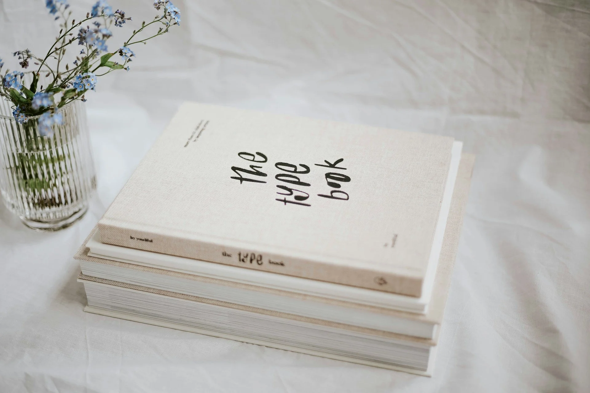
At Spine Book Printing, you can choose between paperback and hardback styles, in sizes such as A5 or a larger novel format. For interiors, we offer options like 100gsm uncoated paper or 150gsm silk, suitable for a range of genres and book types.
Avoiding Common Layout Pitfalls
Layout should support the reading experience, not get in the way. Problems often start with spacing decisions that don’t account for print limitations. If margins are too tight or the font is hard to read in print, the book can end up looking uneven.
• Always leave enough space in the inner margin near the spine so text doesn’t get lost in the binding
• Use consistent line spacing and font sizes that feel comfortable to read over long stretches
• Avoid compacting everything just to save pages; white space has value and helps guide the eye
If your book includes images or charts, make sure they’re high resolution and clear once placed. Keep them out of the margins and give them enough room to breathe. Too many visuals crowded together on a single page can confuse readers and make the book feel rushed.
Staying on Track With File Setup
Once the interior layout is coming together, we double-check that every part of the file matches the print setup. One small step out of place can throw off the rest of the job. We try to be consistent with file names, version tracking, and layout notes from the start.
• Confirm spine width calculations based on page count to align the front, back, and spine cover properly
• Make sure all pages are in the correct order and that blank pages, if used, are intentional
• Leave room around text and imagery so nothing ends up too close to the trim line
Safe zones and bleed areas are easy to overlook if you're focused only on the content. But keeping those in mind helps prevent key parts of the design from being trimmed off. That applies especially to full-page images and covers.
Paperbacks can be finished with either matt or gloss lamination on the cover. Matt gives a soft touch and reduced glare, while gloss highlights colours and images for a vibrant effect.
Knowing What to Expect From Print Options
We often say that print finish makes a bigger impression than people expect. It affects how the book feels, how durable it is, and how well it handles over time. That’s why it’s worth matching print choices to what the book needs, not just what looks good in a sample photo.
• Lighter paper tends to work well for books with lots of pages, while slightly heavier stock adds weight and smoothness where needed
• Choose a black and white print for most text-heavy books to keep things sharp and easy to read
• Colour works best for certain books with diagrams, illustrations, or instructional content
Cover finishes matter, too. A matt finish gives a soft, no-glare feel. Gloss gives a shine that brings out colours but may reflect light more. We don't chase trends here. We keep it aligned with how the book will be handled and who will be reading it.
It can also help to think about how durable you need the book to be. For books that will be handled often or carried about, choosing the right cover and paper stock means the book will hold up better with use. For books that are more of a keepsake, you might prefer a plush feel with heavier cover options. Planning this detail helps the end result look and feel right for its purpose.
Keeping the Process Stress-Free
Sometimes things fall behind just from tweaks that come too late in the process. That file you were sure was final ends up needing three more edits, or you forget a margin setting that throws off the whole layout. We’ve seen enough of those problems to know that a short pause before sending files off can save days of delay.
• Leave space in your schedule for one last full check before print
• Avoid changes to layout or text unless they’re absolutely necessary
• Ask questions early if you’re unsure about file setup or spacing
It’s far easier to solve a small layout issue when everything else is calm and steady. That’s why we avoid last-minute layouts or submitting files without doing a self-review first. The quiet moment before production often makes the biggest impact on final quality.
Getting questions answered at this stage can also help reduce nerves. Chatting through your design ideas or double-checking the order of chapters gives you a chance to fix errors before they carry through to the final version. By staying organised with your process, you will notice fewer things going wrong as deadlines get closer.
A Finished Book You’ll Be Proud Of
Print doesn’t have to be complicated. When each piece is in place and files are built with care, everything holds up better. Timing becomes predictable, the printed book looks like it should, and there are fewer chances for something to go sideways. It’s not about doing everything perfectly on the first try. It’s about making smart decisions early and taking time when it matters.
A finished book should reflect what you wrote, not the stress of getting it across the finish line. We’ve found that simple preparation, attention to layout, and a steady process take much of the pressure out of printing self published books. Every polished page starts with that kind of quiet planning.
A steady pace really helps when pulling together all the final pieces. If you allow yourself time for checks and don’t rush the details, you’ll feel more confident about the printed result. Remember, print is about more than just words on paper. Making careful adjustments here or there is what makes the finished book stand out as something you’ll be glad to hand out, gift, or sell.
Preparing your book for print is easier with expert support. We take care of every detail, from accurate margins to thorough file checks, to help your work be print-ready. No matter your experience level, our guidance makes the process feel straightforward. For those planning on printing self published books, Spine Book Printing is here to help everything come together smoothly when you’re ready to move forward.