What to Review in Book Design Interior Before Formatting
Before you hit the formatting stage, it is smart to take a closer look at the structure of your book design interior. Small layout choices can have a big effect on how a book feels once it is printed. Pages that read smoothly often come from quiet behind-the-scenes planning.
Checking your interior layout early helps spot things that might disrupt a reader’s focus, like text that feels cramped or inconsistent use of fonts or page breaks. By working through these details upfront, you end up with a cleaner, more reader-friendly book that feels like a finished product right from page one.
Layout Basics That Support Easy Reading
The bones of a book’s interior layout come down to space and flow. Without enough breathing room, pages can feel rushed. Too much space, and a book might seem padded or empty.
Start with margins that give readers comfortable room without losing space for story or content. Margins that are too tight near the spine can make reading hard, especially in bound formats.
Watch how text blocks move between pages. A clean carry-over keeps readers engaged. Gaps, overlaps, or broken sentences create distractions.
Check page numbers and headers. These should sit in the same spot throughout and not draw attention away from what you're reading. Headers on chapter openers often work best when left off to create a clean reset.
Keeping layout shapes regular across all pages creates rhythm. Readers are not thinking about it, but they notice when things shift mid-book. It can help to give a quick flip through printed pages to see where the eye rests, and if certain elements pull attention too strongly or fade in a way that diminishes the flow of the story. Noticing these shifts early gives you a chance to make gentle corrections in the draft before formatting.
Font Choice and How It Shapes Feel
A well-chosen font is like a clear voice guiding the reader along. Too small a size or too packed a line can lead to eye strain. On the other hand, giant letters or over-spaced lines can feel clumsy.
Stick to one or two typefaces at most. Use variations like bold or italic instead of switching font families.
Aim for fonts that are open and legible on paper. Some decorative fonts read fine on screen but collapse on print.
Line spacing matters almost as much as font size. Tight cram can make paragraphs blur together. Looser spacing should still group lines clearly so the eye does not wander.
Readers often do not notice a good font, which is a good sign. If people stop to think about the typeface, it may be pulling focus from the story. Try testing your top choices by printing a sample page and reading from arm’s length, noting which fonts look inviting and which make your eyes search for the next line. Making these small checks before formatting settles the text in a way that will feel natural and comfortable on every page.
Paragraph Structure and Indentation
Style makes a difference in how someone takes in a block of text. Consistency is the anchor here. Without it, pages can feel messy or rushed.
Pick a paragraph style and hold to it. That goes for spacing above or below, and whether or not you are indenting the first line.
If writing includes dialogue, stick to one format. For example, if character speech always starts on a new line, make that a rule across the entire draft.
Break up longer blocks of text into more readable chunks. Try not to let a paragraph run for half a page. A pause gives room for the idea to land.
Well-spaced paragraphs that follow a set pattern help people feel confident moving through your book. When reviewing, check if your text encourages the eye to flow from one line to the next, especially where dialogue, inner thoughts, or descriptions meet on the same page. Paragraph consistency, even in small details like the number of spaces after each line, builds a peaceful background for your reader’s journey through the book.
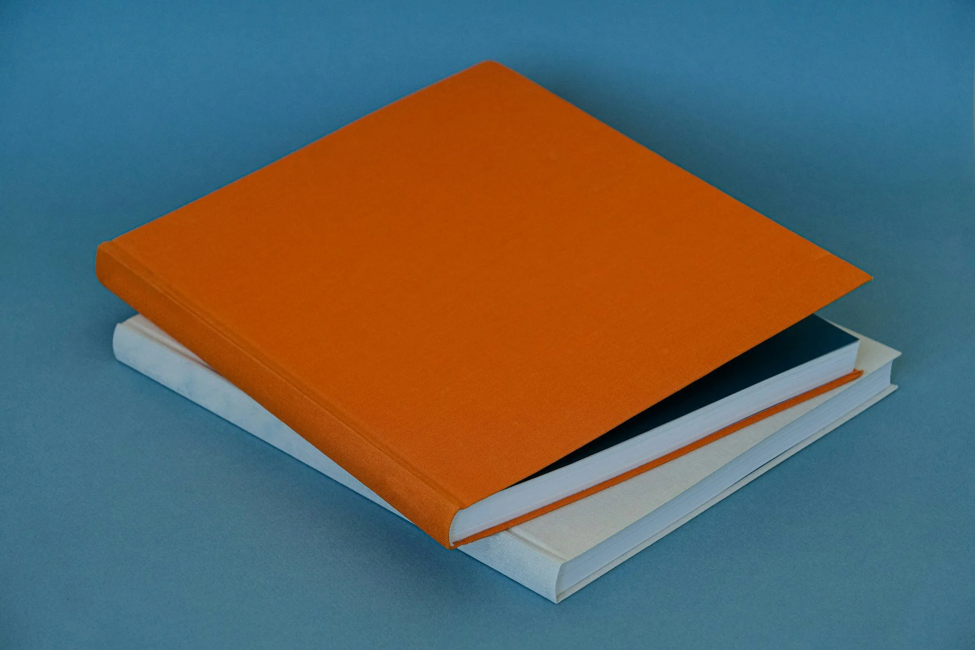
Making the Most of Images and Visuals
Images can strengthen a book when placed with thought. But without care, they can interrupt or clutter a page.
Put images near the content they relate to. Avoid splitting text and placing visuals several pages apart from their reference point.
Leave enough clear space around each image. If words press too close, it makes both text and picture harder to take in.
Always separate captions from regular text. A slight shift in alignment or font helps show the reader what is part of the story and what is a label.
Visuals benefit from quiet design. Supporting the main text, rather than crowding it, makes them work harder without looking forced. Consider a strategy for recurring visual elements, like charts, maps, or illustrations. Decide if they are better grouped in a special section or spread throughout for emphasis. Embedding images with just enough space makes each visual a restful stop, not an obstacle to reading.
Checking for Balance on Each Page
A well-balanced layout helps readers stay centred. When spreads tilt heavily to one side or line length varies wildly, reading can feel unsettled.
Review how content looks across spreads. Aim to keep similar amounts of content flowing left to right, so one side does not feel heavy.
Do not end major sections halfway down a page unless there is a pacing reason. Sudden drop-offs can feel like a layout error.
Start chapters clean. That usually means beginning on a new page with clear spacing and a visual break from the previous content.
These finishing touches help a reader settle into each new chapter without needing to reorient themselves every few pages. To further check for balanced pages, look at your draft from different angles. Sometimes, changing the zoom or printing a reduced-size mock-up reveals unnoticed imbalances. When all elements feel evenly weighted, readers can focus fully on what matters most, your writing.
Why a Careful Interior Review Pays Off
The time spent reviewing the book design interior before formatting sets everything else on steady ground. It builds a strong layout that supports the pacing and rhythm of your words. Adjusting margins, checking image placement, or setting paragraph styles now will help avoid bigger adjustments when you're further along.
When a book reads without interruption, the person holding it is more likely to stay with it past the first few pages. A clean interior does not just make the writing easier to read. It makes the entire book feel considered and complete. And that is something worth aiming for.
Preparing to finalise your layout is a big step, and we are here to help confirm every page is working as it should. Taking the time to review your book design interior means you are not leaving the reading experience to chance. A strong layout supports your writing and helps keep readers focused from start to finish. At Spine Book Printing, we pay close attention to the details that make your work clear and polished. Let us know when you are ready to talk about your next steps.