Why Spine Text Positioning Is Important in A5 Prints Size
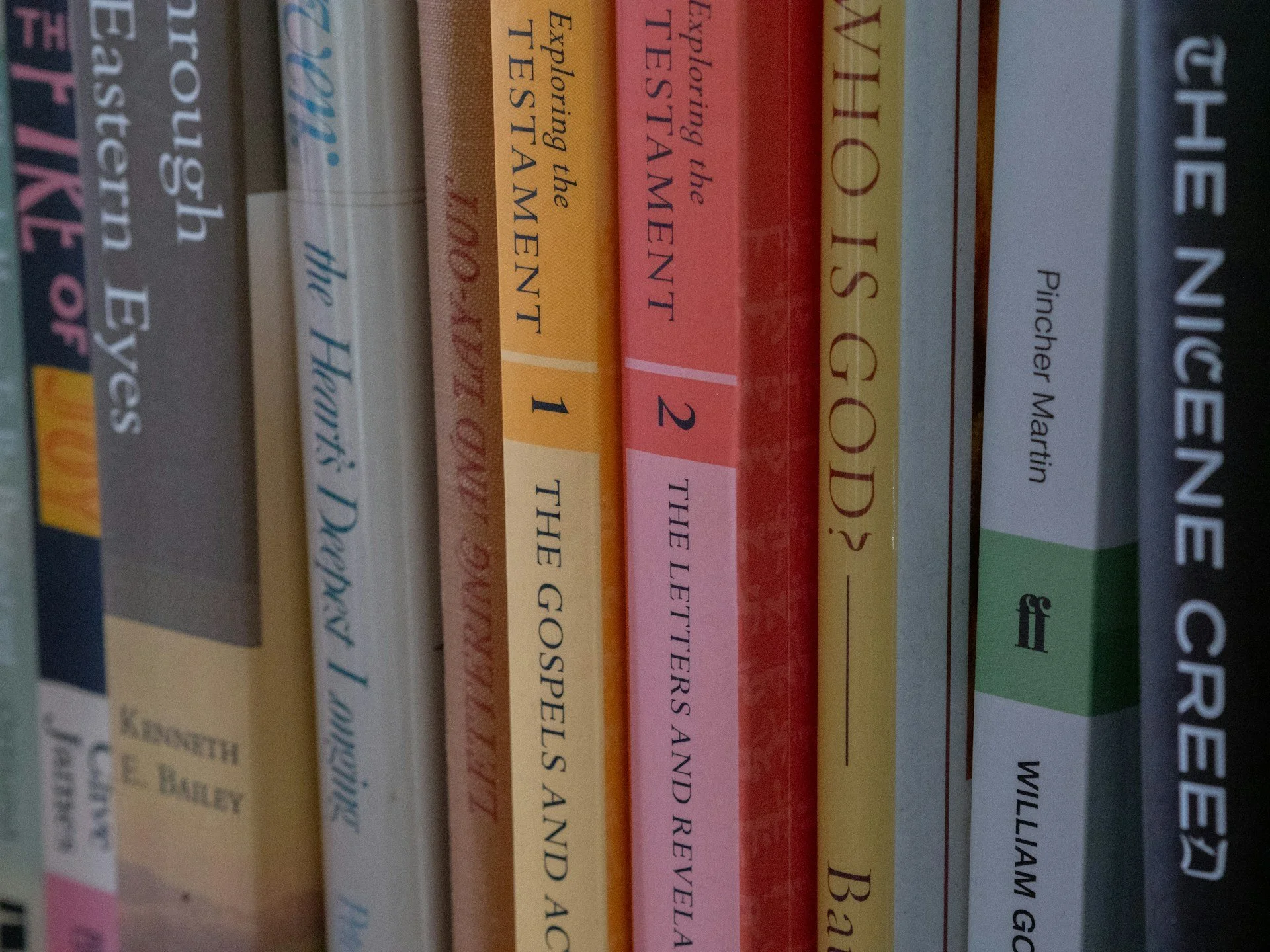
Spine text might seem like a small detail, but when you're working with an A5 prints size book, it has an outsized impact. It’s often the first thing someone sees when a book is stacked sideways on a shelf or shown on a fair table. If it’s off-centre or too small, it can make the entire book feel off. If it’s done well, it brings the whole design together, even before you’ve turned a page.
Because A5 is a compact size, we always recommend paying close attention to the spine space. Unlike larger formats, there’s less give here. Every millimetre matters. Positioning the spine text properly helps make sure your book looks complete and functions well when on display or stored.
Getting the Spine Right from the Start
The width of your spine comes from a mix of how many pages are in your book and what kind of paper you’re using. Thicker paper? Wider spine. Fewer pages? Thinner spine. That means even small changes earlier in the process can affect your cover layout down the line.
We’ve seen how early layout decisions shape the final cover. Choices like font size, line spacing, and image placement might seem like design details, but they feed into the overall size of your book. If you're doing edits late in the process and a bunch of pages get added or removed, that can throw the spine off. A spine that no longer fits the cover can cause the whole file to be reworked, which adds time and room for mistakes.
Poor planning makes alignment trickier. When the spine width changes without notice, it’s easy to misplace the text or have it drift into areas where it shouldn't be. Once that happens, the result might be uneven print or text getting lost in the spine fold.
Common Issues with Spine Text Alignment
We regularly spot a few common missteps when it comes to spine text. All of them are avoidable with a bit of preparation.
• Text that looks off-centre often comes from last-minute changes to page count or resizing. Even a slight miscalculation here can result in the title not sitting properly on the spine.
• If the spine artwork doesn’t flow smoothly with the front and back design, it creates a visual break. It makes the whole book seem less considered.
• Making the font size too small, hoping it will “just fit,” often backfires. On an A5 book, this can make the spine unreadable altogether.
• Text placed too close to the fold can end up disappearing into the binding. Printed pages don’t lie flat the same way digital layouts do, so it’s good to leave space around the centre line.
Careful checking helps avoid these issues. Leaving space for flexibility and not forcing too much into too little space gives the design some breathing room.
How A5 Size Affects Spine Design
Every print size comes with its own limits, but A5 prints size tends to be less forgiving. There's less area for stretched titles or bold text. It's easy to forget how narrow a spine will actually be when you're designing on a big screen. What might feel balanced while zoomed in becomes cramped or unreadable once printed.
That smaller canvas means you’ve got to choose wisely. Text needs to be both legible and laid out cleanly. Books with short titles may work well, but longer ones often need trimming or reworking. Think about the length of words and how they’ll actually fit. Select fonts that stay sharp even when sized down.
You don’t need to cram in extra words to fill the space. Instead, spacing and alignment matter more. A shorter title properly lined up often looks more professional than a long one squeezed into the spine edge.
Best Practices for Creative and Clean Spine Typography
Typography plays a big part in making the spine easy to read. With A5 books, where space is limited, we try to reduce anything that clutters or shrinks the type.
• Use typefaces designed for smaller sizes. Sans-serif fonts tend to stay more legible when scaled down.
• Keep the text short and balanced. Long subtitles can go on the cover, not the spine.
• Align the text to the centreline of the spine. That way, even minor shifts won’t make it look off.
• Make use of bolding, font weight, and tracking to improve visibility, but don’t overdo it.
• Let the spine design work with the front and back covers. If the covers are bright or playful, the spine text can reflect that style without making it busy.
We’ve found that consistency across the full wrap matters more than decoration. It’s better to keep the spine simple and strong than make it fight with the rest of the cover.
Why It Matters When Printing for Events or Retail
As spring events begin to pile up on the calendar, print projects tend to move on tighter timelines. Books headed for school fairs, book tables, or conferences are often stacked side by side, with only the spine showing.
When someone walks past a table or scans a crowded shelf, the spine does all the talking. Bad layouts or unreadable type won’t stop someone in their tracks. Clean lines and visible titles might.
If you’ve printed for events before, you’ll know how small details like spine clarity can make setup easier too. Books that stand well on display and don’t need flipping to identify save time during staging. When everything’s centred and legible, it simply works better under pressure.
This time of year is perfect for reviewing layouts under natural spring light. It's easier to catch inconsistencies or subtle colour shifts that might blend on screen but clash in person.
A Good Spine Brings the Whole Book Together
Spine text positioning isn’t just about fitting words into a narrow space. It’s about making the whole book feel considered. It helps your layout line up, your cover read well from every angle, and your book stand strong next to others.
When you're working with A5 prints size, getting the spine right adds polish and clarity to your finished product. Small tweaks during early setup can prevent larger problems later on, keeping each stage smoother from layout to launch.
Getting your A5 print run right starts with careful planning, especially when it comes to spine alignment and readability. We know a clean, professional result relies on understanding your layout options and choosing the most suitable format from the beginning. Our paperback product for the A5 prints size makes it simple to match spine width with your selected paper type and page count. At Spine Book Printing, we are always ready to help with layout advice and file preparation to make sure your project goes smoothly from start to finish. Send us a message and we’ll take care of the rest.