Why Book Covers in Hardback Need Special Layout Choices
Getting the layout right is one of the final steps in preparing a book for print, and it’s often where things get unexpectedly tricky. That’s especially true when working on a hardback. Many writers focus on the cover design itself, a strong image, a stylish title, a clean layout, but hardbacks bring a few more things to the table.
The structure of a hardback means the printed jacket needs extra space. That includes the board width, hinge folds, and the wraparound that tucks under the top layer. These all affect how content needs to be positioned. The sooner we shape the layout around those physical parts, the smoother the rest of the process feels. Mistakes at this stage are not just visual, they can affect how professional the finished book looks and feels. Thinking through the book cover in hardcover format from the start helps prevent costly layout resets later.
Understanding the Physical Structure of a Hardcover
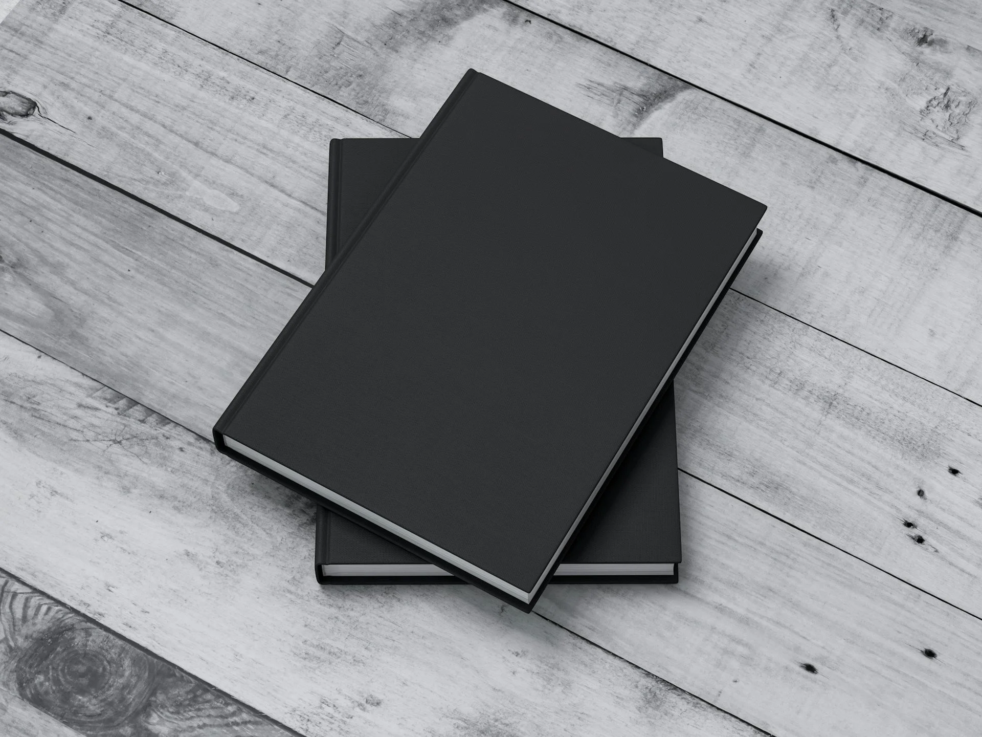
Unlike a softcover, a hardback book is built from solid boards joined to a spine. Between each board and the spine is a hinge section that needs to move freely when the book is opened. All of these moving parts take up physical space, which directly changes how things need to be laid out.
• Bleed space surrounds the cover artwork and is intentionally trimmed off
• Safe zones are where text or key images should stay to avoid loss during trimming
• The spine width shifts depending on page count and paper weight, changing the full width of your layout file
If these areas are not factored in early, text near the spine might land too close to a fold. An image near the edge might get cut off. The harmony between the front, spine, and back can feel off-centre when printed.
Designing with the Fold Areas in Mind
One of the trickier parts of laying out a hardcover is dealing with how the cover folds around the book. Even though your design starts flat, it's built to bend. That movement changes how each element sits in its final place.
• The front cover should include a margin buffer for folding, avoid placing text or logos tight to the edge
• The spine should have clear enough width to display text without cramping or overlapping folds
• The back panel often includes blurb or barcode details, which need their own safe zones
Symmetrical spacing can help with balance. If titles or graphics rely too heavily on perfect horizontal alignment, they might not look right once wrapped. Designs that use centre alignment or mirrored spacing tend to absorb the fold better.
The Impact of Spine Thickness
The spine reflects a mix of choices, how many pages the book has, the kinds of paper used, and the format. All three work together to determine thickness. A thin book printed on lighter stock will barely have any spine width. A long book with heavier paper will have a wider spine and more room for text.
• Only certain spine widths allow for printed text, a narrow spine cannot hold legible type
• Final layout should match the exact spine thickness, or artwork may be misaligned
• Misjudging the size can throw off front and back alignment, which becomes visible once the cover is wrapped around the boards
This is something we always calculate before artwork is finalised. It is much easier to adjust a layout to match a precise measurement than to fix spacing issues after printing has begun.
Adjusting for Cover Finish and Printing Choices
Once the design feels balanced on screen, we start thinking about how it will print. On a hardcover, colours and lines behave differently depending on the finishing choice. A gloss cover reflects more light, which can boost contrast but may highlight fingerprints on darker shades. A matt cover absorbs light, offering a soft, muted look that can shift how dark areas appear once dry.
• Gloss finishes make images pop but may wash out light text on reflection
• Matt finishes flatten colour tones slightly, which can affect background artwork or gradients
• Oversaturated colours may darken more on board printing than on screen
Thinking about this stage as part of the layout process, not as an afterthought, helps reduce surprises. Light colours may benefit from added contrast. Fine lines may need to be bolder if the finish mutes them.
At Spine Book Printing, you can pick from gloss or matt lamination for your hardback cover to get the right style for your book. Our inner paper options include 100gsm uncoated and 150gsm silk to match different page and colour needs.
Beyond the Layout Software: Reviewing Proofs with Care
Nothing replaces the feeling of holding a printed proof in your hands. With a hardcover, so much of the final impression comes from the way folds behave and how layers line up through the wraparound process. A file that looks great digitally can shift once it's wrapped, cut, and laminated.
• Text can drift toward a fold, making it feel cramped in final print
• Artwork placed near the edges risks being trimmed or hidden under wrap
• Colour shifts in ink can change tone under certain lights, especially with gloss
We always recommend reviewing a printed proof before going to full production. Fixing a margin point or nudging a logo by a few millimetres is much easier early on than once everything is live.
Giving Your Hardcover the Best Start
Sharpening up the layout for a hardback takes more thought than a simple edit. We look at the physical parts, board thickness, hinge space, spine width, and make those guide the artwork, not the other way around. It is not about designing something that only looks good on screen. It is about making sure what you see really matches what gets printed.
Taking the book cover in hardcover format seriously means thinking beyond looks. It is the structure that holds everything together, and when that structure works with the design, your book does not just look right, it feels right. That kind of attention upfront makes production smoother and helps the book arrive looking as intended.
Getting your layout right from the outset is key, and we are here to help you plan every fold, margin, and wrap. By addressing bleed space and hinge areas early, your artwork stays cleanly aligned across each panel. We check spine spacing and fine-tune your design so nothing drifts off-centre. Planning your book cover in hardcover format with us means you will avoid layout headaches down the line. Speak with Spine Book Printing and let us make sure every element is ready for print.