Why Book Printers UK Use Less Colour in Paperbacks
For most paperback jobs, especially in early spring, we tend to keep things simple when it comes to colour. It's not about cutting corners. It’s about making smart choices that help us deliver timely, consistent results. Around this time of year, requests start to stack up ahead of school terms, talks, outdoor markets, and author events. We find that many spring print requests focus on getting clear, well-made paperbacks done on time, and that often means using fewer colours.
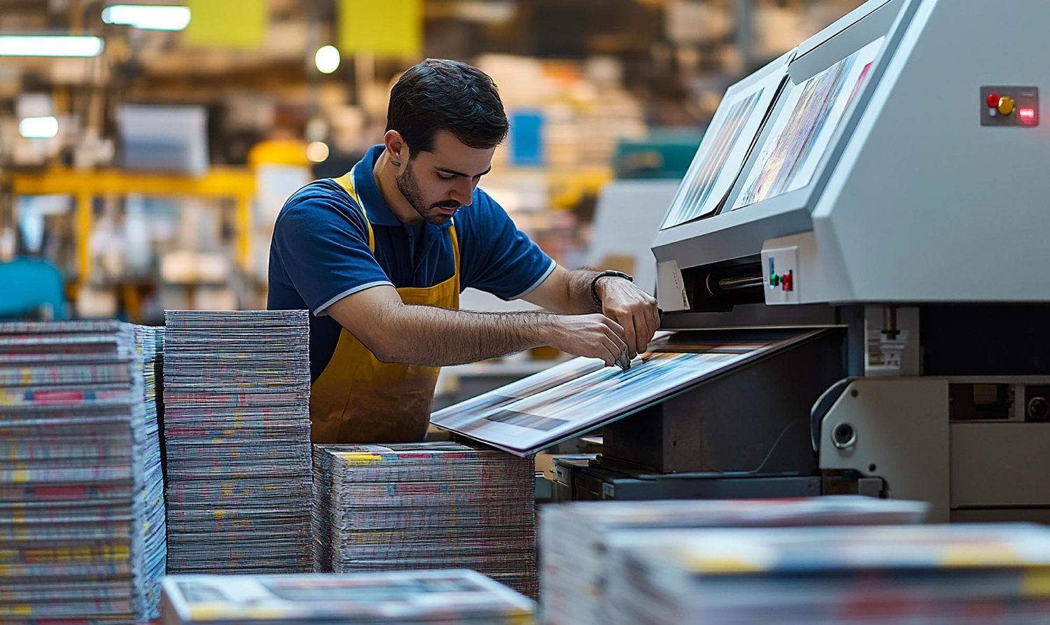
Book printers UK know how to balance demand with output. Simplified colour choices are one of the easiest ways to speed up production without cutting print quality. With more content being prepared for events and outreach, fewer colours can help us stick to tighter delivery windows without driving up costs or slowing the process down.
Why Colour Use is Often Minimized in Paperbacks
Spring is a busy season. That means we need to work efficiently. One of the ways we do that is by limiting heavy colour use, especially on inside pages of paperbacks.
Using fewer colours reduces setup time. With less ink to handle and fewer press adjustments, we can move things along faster.
It helps with layout decisions. When there's less colour to manage, it’s easier to place elements like text, headings, or charts without worrying about clashes or visibility.
It lowers the chance of errors. Overuse of colour increases the risks like print misalignment, colour shifts, or inconsistent shading from page to page.
This choice is not about making everything black and white. It’s about focusing attention and using colour only where it matters most. For example, a clean splash on the cover or accent colours for headers can still add impact without slowing things down.
Balancing Design and Function for Spring Launches
Spring events often lean toward quick interactions. A table at a fair, a reading at a school, or a book stack at a market stall, these all favour designs that are easy to follow at a glance. That’s where reduced colour can actually work in our favour.
Light, clean pages are easier to scan in busy spaces. They also use bolder fonts and fewer distractions, so the message lands faster.
Paperbacks meant for readings or workshops tend to be text-focused. Adding lots of colour often doesn’t serve the content or the audience.
Outdoors or in group settings, readers deal with light, glare, and movement. Books printed with calm layouts and strong contrast hold up better in those situations.
Small size, easy flipping, and simple print layouts help people engage with the book without fuss. A bright, full-colour spread might look slick, but it can also feel overwhelming or be hard to scan with background noise or movement. A neatly designed A5 or A4 paperback with minimal colour often presents better in these settings.
At Spine Book Printing, you can print paperbacks in A5, novel, or A4 sizes with either black and white or colour interiors. Choose from 100gsm uncoated or 150gsm silk paper, and matt or gloss finish for the cover to match your project.
How Simplified Colour Choices Help Stay on Schedule
Approaching mid-spring, printing schedules fill quickly. One of the main ways we handle that is by encouraging smart print setups that reduce back-and-forth. Limited colour helps that all along the line.
Proofs get approved quicker. When clients work from a basic colour scheme, changes are easier to assess, adjust, and approve.
There’s less room for technical errors. Fewer print variables mean fewer chances for something to go wrong between proof and final.
File size is lighter, making uploads, downloads, and checks faster.
With fewer moving parts, we can manage more prints in less time. Colour-heavy jobs tend to need longer review periods, and reprints take more energy if something is off. By sticking to simple, focused layouts and short colour ranges, we help keep projects on track, especially when deadlines can’t shift.
Page Impact Without Overuse of Colour
Just because a paperback doesn’t use much colour doesn’t mean it has to look flat or unfinished. We work with layout and paper choices to bring books to life in different ways.
White space and spacing help guide the eye. Carefully placed margins or chapter breaks give the content room to breathe.
Strong typefaces and good contrast between text and background do just as much as colour to make content easy to engage with.
Cover finish choices like matt or gloss give the outside extra polish, even when the inside stays simple.
Sometimes black and white content on high-quality uncoated paper reads cleaner and feels more refined than a colour-heavy spread on glossy stock. A well-designed page structure with sensible headings, simple icons, and smart spacing can hold its own, even without lots of colour.
If your paperback is meant for wide distribution during a busy season, colour restraint also keeps costs predictable. It makes it easier to estimate print runs, avoid unexpected delays, and manage logistics during high-volume periods. This way, your book looks professional, your scheduling stays reliable, and your project remains on course as events and launch days approach.
Consistency is also more easily maintained when the layout emphasizes simplicity. When every page follows a clear structure, the focus stays on content. Readers appreciate books that are comfortable to navigate, and minimal colour often means less visual clutter. This not only helps your book stand out in busy or competitive environments but also makes it easier for the audience to absorb your key points.
A Smarter Way to Print for Spring Projects
Keeping colour use low gives us more flexibility on every level. It shortens setup time, speeds up reviews, and keeps little errors from becoming big problems. For spring deadlines, when everyone is preparing for an event, talk, or showing, that kind of control makes a big difference.
Book printers UK tend to focus on reliable, repeatable setups this time of year, not because we don’t value design, but because we value what a book actually has to do once it leaves the printer (be on time, feel good in the hand, and read clearly). Stripping back to the parts that matter most helps that happen. When the design supports the message and the print choices support the timeline, the book ends up working exactly as it should. Simple doesn’t mean boring. Sometimes, it means smart.
Planning a paperback for a spring event is easier when you keep things simple from the start, choosing the right paper format and colour helps everything run smoothly. One of the fastest ways to ensure a polished result, especially against tight deadlines, is to work with trusted book printers UK who understand what matters. At Spine Book Printing, we offer flexible formats, clear printing and prompt delivery to keep your project on track. Let us help you get your paperback underway.