How to Print Paperback Books in UK Without Artwork Mistakes
Getting paperback artwork right can be stressful, especially if you’ve never done it before. It's one of the trickier steps when you print paperback books, and when something goes wrong, it tends to show up straight away in the finished copy. Text might get clipped, colours could print differently than expected, or the cover might be slightly off centre. These are small issues on screen, but once the book is printed, they stand out.
We’ve seen how a bit of upfront planning can help avoid these issues. If you know what to check before sending files off, you're more likely to get clean, accurate print results. Ahead of the busy spring print window, checking your artwork early means fewer delays and fewer reprints.
Why Artwork Mistakes Happen Early On
Problems with artwork often begin right at the start. It’s easy to miss small file details that make a big difference later.
Printer terms like "bleed," "trim," and "safe zone" can get overlooked. These areas define how much of your content might get cut or shifted in print, and ignoring them is one of the most common slip ups we see.
Another issue is using the wrong dimensions. If your file isn’t sized for paperback printing, it might look fine on screen but won’t line up once trimmed in the real world.
Colour mode also matters. Many digital files are created in RGB, which works for screens but prints with dull or shifted colours. Switching files to CMYK gives a more accurate preview of how colours will appear when printed.
Missing these early often means costly rework down the line, especially on covers or full page images.
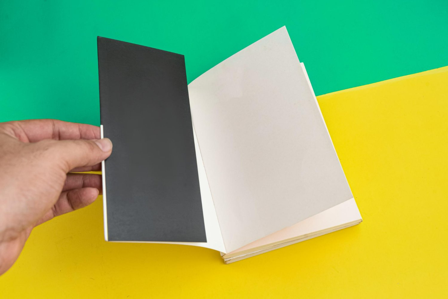
Getting Your Cover Set Up Right
The cover is the first thing people see, and it needs more than just a nice design. It has to fit perfectly across the front, spine, and back of the book. One small misalignment throws the entire design off.
Start by checking your page count and paper type, as these affect the spine width. The spine has to be wide enough for the page number and still leave room for print tolerance.
All spine, front, and back elements should line up cleanly with no parts too close to the trim edge. If titles or images fall outside the safe zone, they risk being cut.
Resolution is another major issue. If you’re using photos or illustrations, anything under 300dpi can cause pixelation or blur. This becomes more obvious if stretching images to fit the layout.
Taking time here helps protect your final cover from awkward cropping or soft graphics.
At Spine Book Printing, we recommend using our paperback templates sized for A5, A4, or novel formats, with safe zones, 3mm bleed, and spine settings built in, matched to 100gsm or 150gsm inside paper.
Interior File Errors to Watch Out For
Once the cover is squared away, the inside pages need just as much care. Errors here tend to affect readability and overall balance.
Page margins can shift without warning if files aren’t formatted correctly. What looks centred in your layout tool might look skewed in the printed book if margin settings vary from page to page.
Fonts are another hidden issue. Some design software uses fonts not embedded in the PDF file, which can cause auto replacements once the document goes to print. Always export with fonts embedded, or stick with basic print safe typefaces.
The gutter (the inner margin where the book is bound) is easy to overlook. If you don’t leave enough room here, text or images near the centre can get swallowed up by the spine when the book is opened.
Spotting these things before finalising your file makes for a smoother print and a much better reading experience.
Spring Printing Schedules and File Checks
Spring print slots often fill up faster than expected. Schools, fairs, independent authors, and educational projects all tend to prepare publishing runs for April and May, so it pays to plan well in advance.
One problem we run into often is delays caused by artwork arriving with errors. If files aren’t quite right, they need correcting before they can go to print. That means pushing your schedule later than planned.
Rushed timelines make it harder to spot mistakes, so giving yourself time for at least one proof copy is a smart move. Viewing a physical proof helps you catch missed margins, blurry images, or text alignment issues before committing to a full run.
Avoid last minute fixes wherever possible. They create bottlenecks in the production timeline, especially when multiple spring jobs are queued up for binding and trimming.
Planning your artwork now keeps your place in the print line and gives room to fix anything early on.
Using Print Templates and File Support the Right Way
Working with a proper print template means fewer errors during file setup and less guesswork on sizing. Most issues come from trying to manually guess trim lines or spine widths, which almost always leads to slip ups.
Templates created for paperback printing include all the right bleed and safe zone settings. When you use a template that matches your final book size, it gives you a strong layout foundation, especially for covers.
Design tools like InDesign or Affinity Publisher often have basic print checks built in, but they won’t catch everything. If you’re unsure, running your file past someone for a second review could make all the difference.
Print templates also reduce the need for scaling or cropping last minute, which can affect sharpness or content placement. A clean design sitting inside the right format speeds up production and lifts the quality of your print copy.
We recommend keeping template use consistent across both cover and interiors for the most predictable results.
Keep Your Artwork On Track From the Start
Artwork matters more than many people realise during the early stages. When it’s done right, your book flows cleanly from cover to last page, without distractions like crooked margins or faded colours.
Starting with the correct file size and colour mode, and keeping layouts within safe zones, helps make sure what you see on screen closely matches what arrives in print. At busy times like spring, that extra bit of prep time is well worth it. Every clean file shortens the time from submission to delivery, which means less stress and a smoother print run from beginning to end.
Spring projects go more smoothly when your files are organised and layouts double checked. We’ve supported countless customers in spotting issues like misaligned covers and margin mix ups before they go to print. Taking care of the details early ensures a simpler process down the line. When you’re ready to print paperback books with confidence, Spine Book Printing will guide you every step of the way. Reach out to us and let’s make your next print run the easiest yet.