Which Book Cover Elements Grab Reader Attention
You really can’t judge a book by its cover unless you're browsing through stacks of them. Then, like most readers, you're absolutely judging. Before the first page is ever flipped, the cover has to do its job. It’s the first connection a reader makes with a story, and that impression has to count. A book’s cover isn’t just packaging, it’s a silent pitch. It says what the book is about, what mood it's setting, and why someone should stop and pick it up.
When it comes to print design and layout essentials, the cover is where it all begins. Strong visuals, careful text choices, and clever use of space are more than just design tasks. They are storytelling tools. Whether it’s a children's adventure, a poetry collection, or a business guide, the cover should reflect what’s inside while standing out from the rest. Let’s break down which elements make a cover pop and why it matters more than some might think.
The Power Of Visual Elements
A good image can say more in a second than a sentence can in a paragraph. When it comes to book covers, visuals are a core part of the message. They’re what grab someone walking past a shelf or scrolling through listings. The right visual doesn't just catch the eye, it builds curiosity.
Here’s what makes a difference:
- Imagery that matches the mood: Photos or illustrations that reflect the book’s tone help set the reader’s expectations. A dark, atmospheric image may suit a mystery. A joyful sketch might be perfect for a children's story. The goal is not just to look attractive but to echo the book’s purpose.
- Colour choices that speak up: Colours influence how someone feels about a cover. They trigger emotion and help with recognition. A calm, pastel palette can create a soft tone, while strong, contrasting colours might shout for attention. Too many colours or clashing tones can be overwhelming.
- Visual balance: Placing elements on the page so they feel balanced makes the cover more pleasant to look at. When everything competes for attention, the design feels chaotic. But when elements work together, it’s easier to focus and more likely to draw someone in.
A poetry collection, for example, might have a minimalist design with a single illustration, muted colours, and ample space around each element. It doesn’t scream for attention, but it draws a quieter, more reflective reader in. That’s the power of clear visual direction.
Typography And Text Placement
Words are not just for the inside of the book. On the cover, typography has a key role in drawing interest and guiding attention. It’s not simply about using a stylish font. It’s about making sure the title and author feel right on the cover, in both placement and appearance.
Here’s what matters:
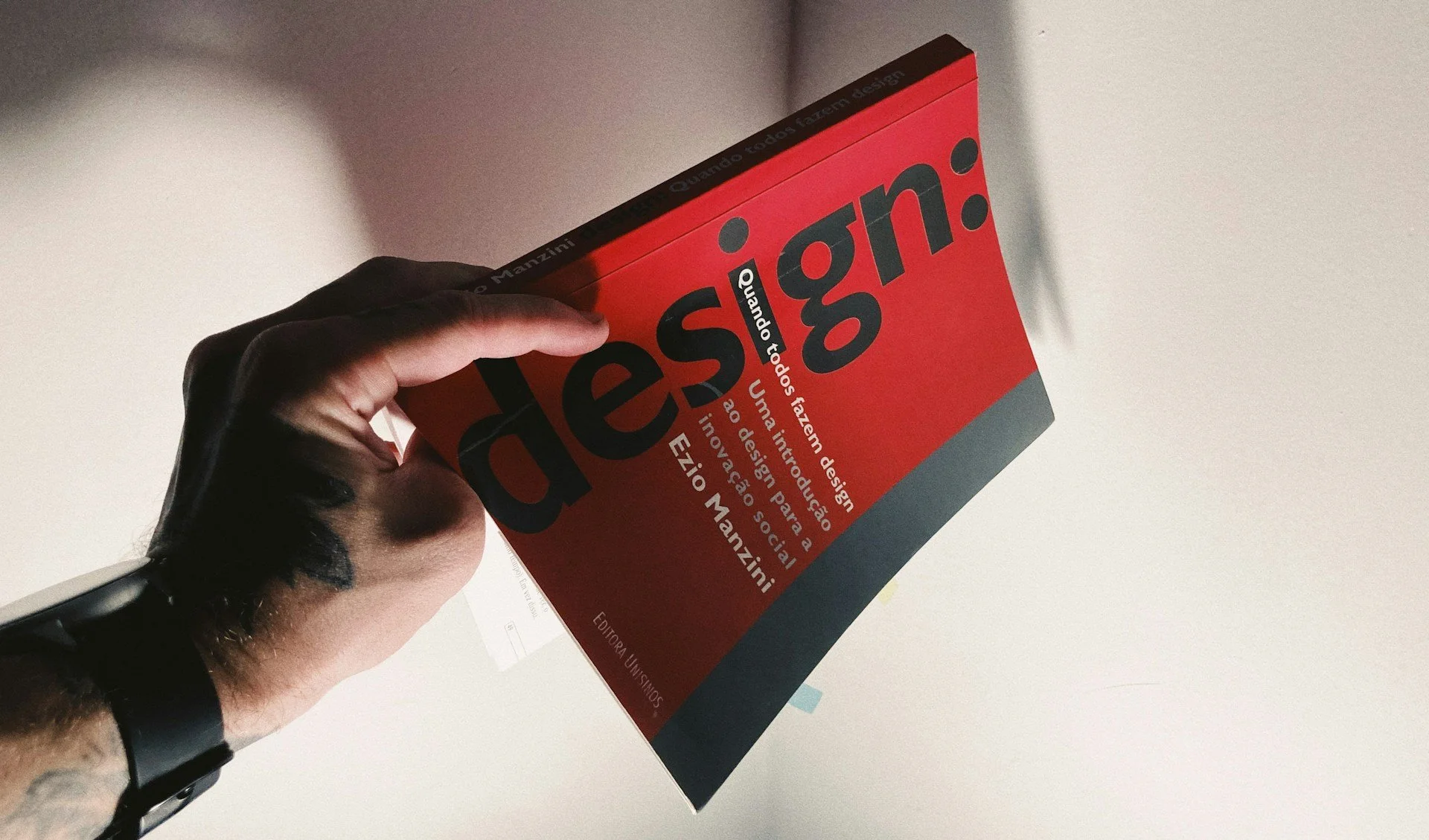
- Font choice: Fonts carry personality. A serif font can feel classic or formal. A handwritten script might come across as personal or artistic. A bold, block-style font often suits gripping thrillers or action-focused novels. Matching the font’s style to the book's tone helps create a stronger connection.
- Font size and style: The title should always stand out and be readable from a short distance. A font that’s too thin or too ornate might disappear when seen from afar or as a thumbnail online. The subtitle and author name should support the title without competing with it.
- Text hierarchy and placement: Most people read top to bottom and left to right. This means titles at the top and smaller supporting text below can guide the reader smoothly. Effective design gently leads the eye: bold title, supportive subtitle, well-positioned author name.
When these pieces come together, the text becomes part of the artwork. It adds to the draw of the cover rather than distracting from it. Designs that look trendy but ignore readability often fall flat. Strong covers let the writing shine just as much as the visuals.
Making The Most Of Space
Space is more powerful than you might think. The temptation to fill every bit of the cover can be strong, especially when trying to show value or detail. But actually, how you leave space untouched makes all the difference.
White space, or negative space, gives the eye room to breathe. It improves legibility, creates clear separation between elements, and keeps the design tidy. Cluttered covers are harder to digest. The brain doesn’t know where to look first, and that can make a reader put the book down before even engaging.
To use space well:
- Group related elements, like keeping the title and subtitle close
- Leave enough margin space around the edges
- Keep visuals away from the text so nothing looks squeezed
- Give the eye a clear start and direction across the page
Think about how people view book covers. Often, their eyes track from top to bottom, left to right. With that in mind, a balanced layout should flow naturally, guiding them from one element to the next. For instance, starting with a strong image, then to the title, then subtitle or blurb, finishing with the author’s name. This kind of gentle flow keeps the focus and creates a more enjoyable visual experience.
Designing with space in mind feels a bit like tidying up a room. When everything has its place and nothing is crammed in, the room feels welcoming. The same goes for cover design. Less clutter often means more impact.
Special Finishes That Draw Readers In
There’s something unforgettable about the feel of a well-produced book. The visual design gets attention first, but the tactile experience can leave a lasting impression. This is where special finishes can make your book stand out.
Start by thinking about lamination. A matt finish gives a soft, almost velvety touch that reduces glare. It suits more subtle or emotional reads—think poetry, memoirs, or thoughtful fiction. On the other hand, gloss finishes catch the light and make colours pop, great for high-energy books or ones targeted at younger audiences.
Beyond lamination, other finishes bring character:
- Embossing raises specific elements like titles or patterns, giving a textured effect
- Foil blocking, often in gold, silver, or copper, adds shine and elegance
- Spot UV is a clear glossy layer used sparingly to highlight parts of the design
These finishes grab more than eyes. They get fingers to linger, too. A book with an embossed title or a smooth matt surface just feels more polished. That tactile factor can help a reader connect with your book before they even open it.
Paper choice also plays a part. A thicker, silk-coated paper or textured uncoated paper gives a different feel. It communicates care, budget, and purpose all at once. You don’t need every special feature, but picking just one or two can give your book that edge.
Design Choices Worth Pausing For
Making a strong book cover doesn’t mean doing everything at once. It’s about making the right choices that all work together. Imagery, typography, colour, space, and finishes all carry their weight. Each one adds a little to how your story is introduced before the first line inside is even read.
Your cover should hint at what's inside without showing all the cards. It can be bold or understated. It might shout with colour or whisper with space. Embossing might make sense for one project, while a simple gloss finish might suit another. There’s space for all styles, but the common thread is always intention.
Getting the print design and layout essentials right isn’t just a visual job. It’s about how your book is presented to the world. Whether fiction or non-fiction, memoir or manual, how it looks and feels creates the first impression. Taking time at this stage means your book is more likely to connect, engage, and be remembered.
Your book cover is the gateway to your story, and with the right touches, it can captivate and hold a reader's attention. Explore the potential of expertly crafted covers with Spine Book Printing to enhance your book's visual appeal. Our book design interior services ensure that each element, from typography to special finishes, aligns perfectly with your creative vision. Let us help you make a lasting first impression that beckons readers to dive into your pages.